 In the article titled “Horror Is a Constant, as Artists Depict War,” by Alissa J. Rubin, the topic of focus is the content and message of artwork depicting real world conflict and violence. Rubin examines the nature of these artistic reactions in both medium and visual content. She also analyzes the aspects and war art also found in journalism, as well as what differentiates the two.
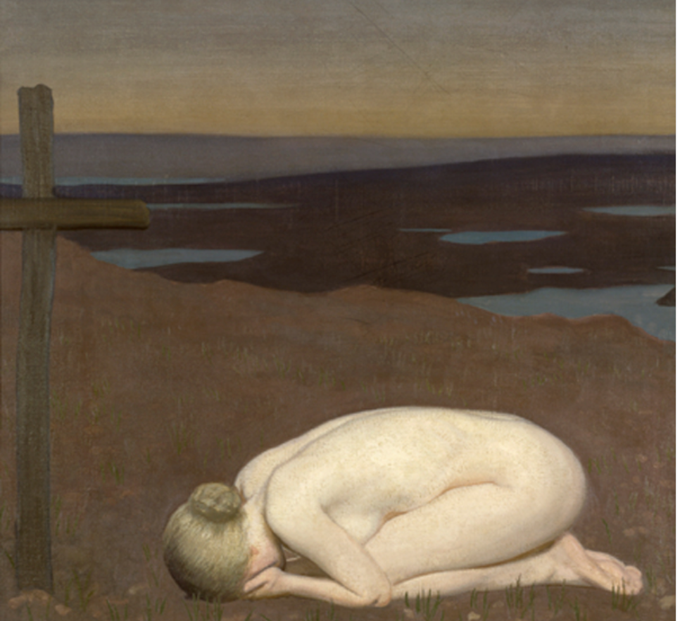
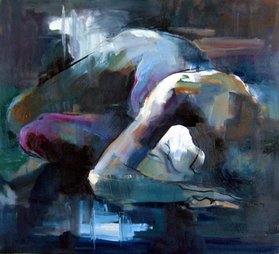
The aspect of this article that stood out to me the most was the key questions about war-reaction art, particularly the ones about the goal of the work and what aspects would make it the most effective to the audience. Near the bottom of the second page she asks “Are gore and blood the most important things to portray, or is it the moment of utter grief that follows?” To answer this question is very much an opinion, and very personal. For wide spread attention, depicting the actual violence is much more of an attention grabbing subject. However capturing pure grief is something so raw that it will elicit a more deep reaction with the viewers it does attract. The second article, “When Modern Art Met Modern Warfare,” by Ann-Marie Michel, brings up a very similar topic that helped me answer the question above. One the second and third pages Michel writes about the use of anonymous faces of soldiers in World War One paintings. The painter “believes that seeing these faces helps the viewer move past the facts and figures.” This exemplifies the personalized aspect of war and coping mechanisms. By adding in the faces of those who suffered, it may not be flashy but the connection of the artwork to the backstory and the audience is much more real. George Clausen’s allegorical painting Youth Mourning, 1916, is the perfect example of an artists depiction of grief in response to war. It completely embodies the personalization and aspects of grief discussed in both articles.
2 Comments
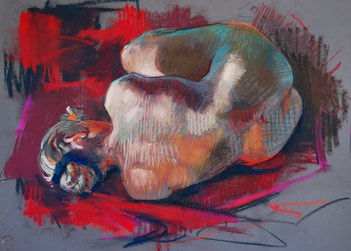
Crawfurd Adamson is an oil painter who depicts very abstracted and contorted figures, while still managing to keep very realistic proportions. This is so amazing to me, considering just how interesting this makes these paintings. The reason I want to take this artists work into account when making my own is because of the creative body language and compositions, as well as the use of expressive color and mark to resolve the image and add to the tone.
Alex Garant is a portrait artist with a very unique way of rendering her subjects. She primarily works in oil paint, and creates an interesting mix between realism and surreal distortion. Garant has a very strong skill in depicting figure accurately, yet does not stop there. By painting multiple of the same image layered off kilter on top of each other, Garant creates the illusion of "seeing double" in a very kaleidoscope kind of way.What i love so much about these is that they still seem so crisp and the image is not in any way muddled by the multitude of contrasting layers. I also really want to take into my own art is how Garant finishes the piece with its relation to the negative space and the background.
The article CRAFTIVISM: THE DO-IT-YOURSELF PRACTICE OF PROTEST DESIGN poses a very interesting question about protest art that I had never considered before. Ultimately it is a question of quantity versus quality, stating that Craftivism is a more effective form of protest art because more people are able to participate in it, making it more widespread, larger, and more of a statement. This would be instead of one large and more professionally crafted piece (possibly by a well known artist or group) to make a statement.
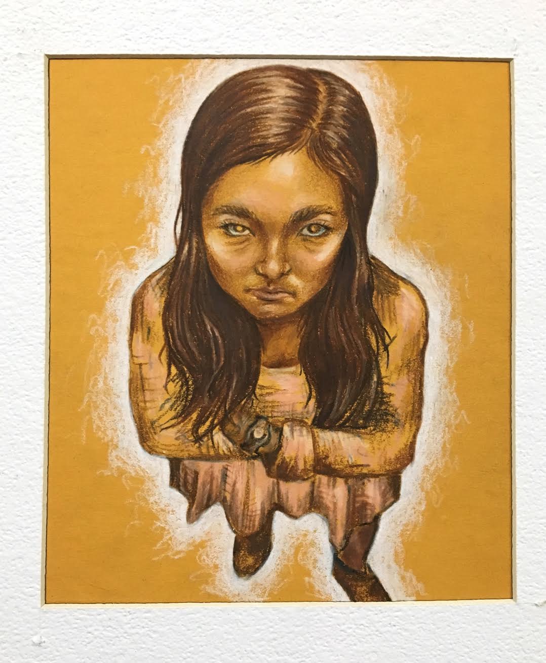
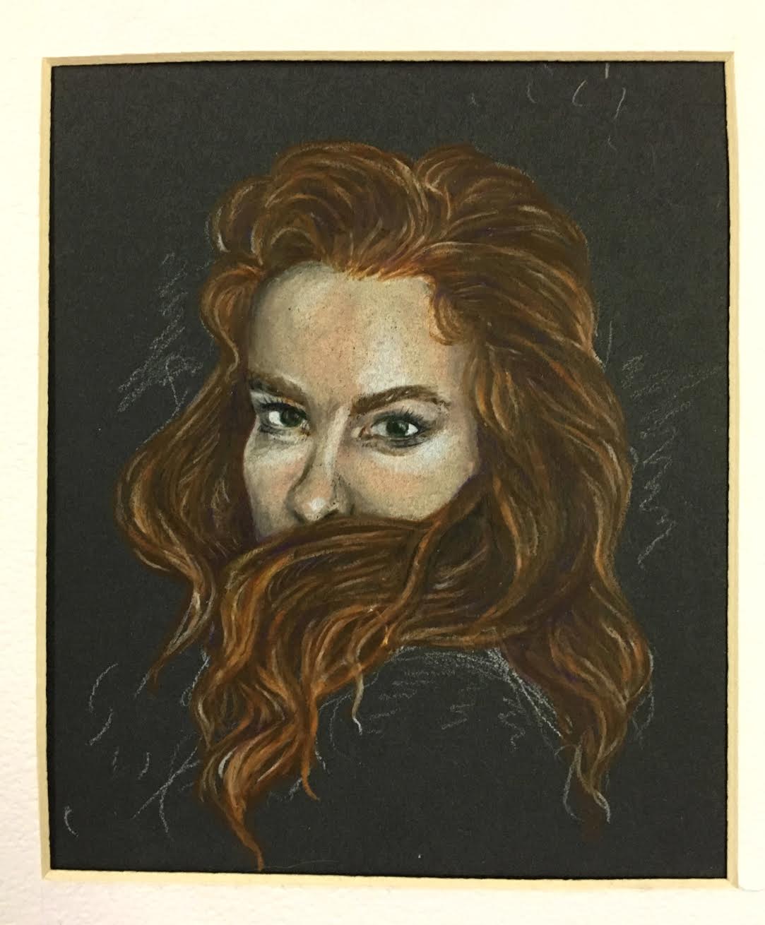
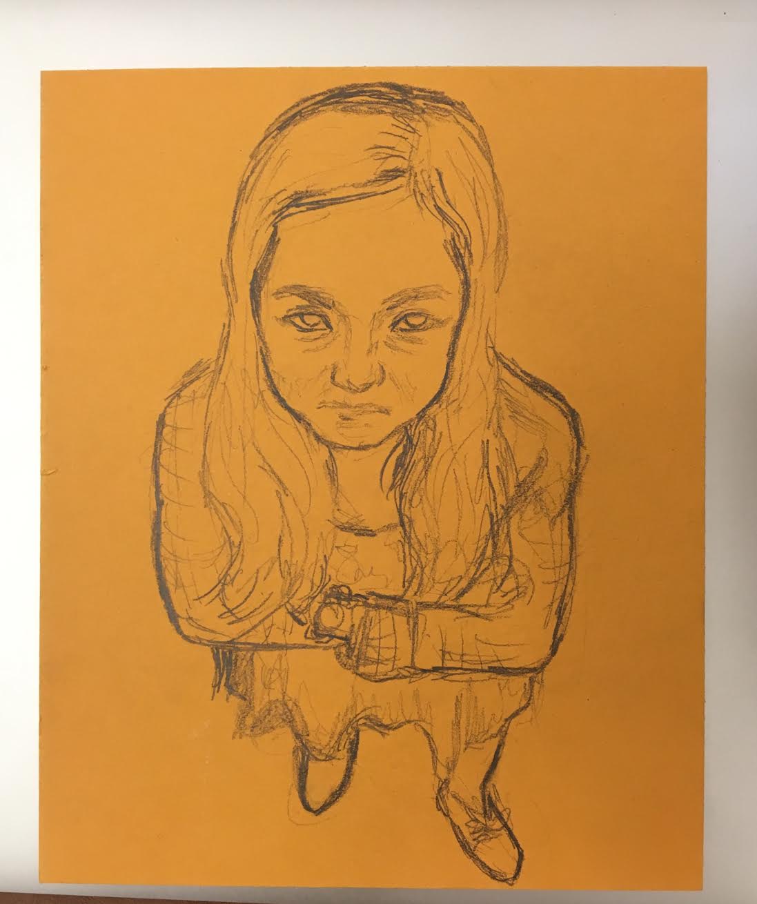
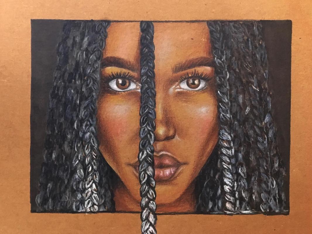
This is a possibility I had never even considered as a substitute for protest art pieces. While I can see that Craftivism might have its benefits in being more accessibly and widespread through the public, I think it might also be slightly difficult to interpret. For example, in the article it mentions one Craftivism piece where inflatable cubes were used in protest to police suppression of protesting. I agree that these large cubes drew in attention and wonderment from onlookers, however the message of what these cubes meant is very unclear without explanation. Overall I like the idea that this article poses, I am just unsure I think the approach it highlights is the most effective way of sending a clear message. In my mind the goal of protest art is to relay the content and goal clearly within the piece so that more people understand it without the needed explanation. This also applies to the “The Guerrilla Girls Are Still Relevant After All These Years” article. One of the reasons that the Guerrilla Girls artwork is still so cherished amount the feminist and art communities is that the work is powerful in that it conveys very aggressively its message. Looking at the Guerrilla Girls work, no one should need to ask for an explanation as to what the work means. By Powerfully and outrightly expressing the content and the intended reaction to the work, protest art becomes much more relevant and effective to its desired effect. I am going to finally (i hope) figure out how I want to utilize portraiture/ faces in my art. I am planning on doing fairly small colored pencil portraits of the seniors in my art class. I am going to work on capturing expression and personality instead of a blank face in my pictures. I am really excited to explore different ways of drawing and using color/ lack of color.
|
Archives
May 2018
Categories |
 RSS Feed
